Where Have You Gone Wayne Font(e)s?
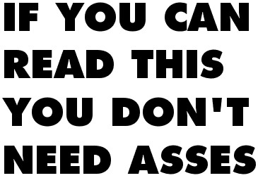
The typeface Tony [Frewin] used to print it is exactly the same typeface Kubrick used for the posters and title sequences of Eyes Wide Shut and 2001. ‘It’s Futura Extra Bold,’ explains Tony. ‘It was Stanley’s favourite typeface. It’s sans serif. He liked Helvetica and Univers, too. Clean and elegant.’
from the franztastic ‘Citizen Kubrick’ article
in The Guardian Unlimited [io9]
Wes Anderson’s also a fan of the font
and so are we
sum bonus Kubrick linky poos:
here lies the 2001 space station?
Dr. Strangelove Dr. Strangelove
Clockwork Orange trading cards wrapper
2001: A Space Odyssey, the comic adaptation by Jack Kirby

head to Coudal Partners for a loatboad o’ mo hottt SK lynx!


 06. Feb, 2008


